There's been a lot of speculation surrounding the shift from the standard three button navigation we've had in Android since the ICS days to a gesture-based system. As hardware manufacturers lose the bezels and fingerprint sensors leave the front, this navigation mechanism costs you what could otherwise be valuable screen real estate.
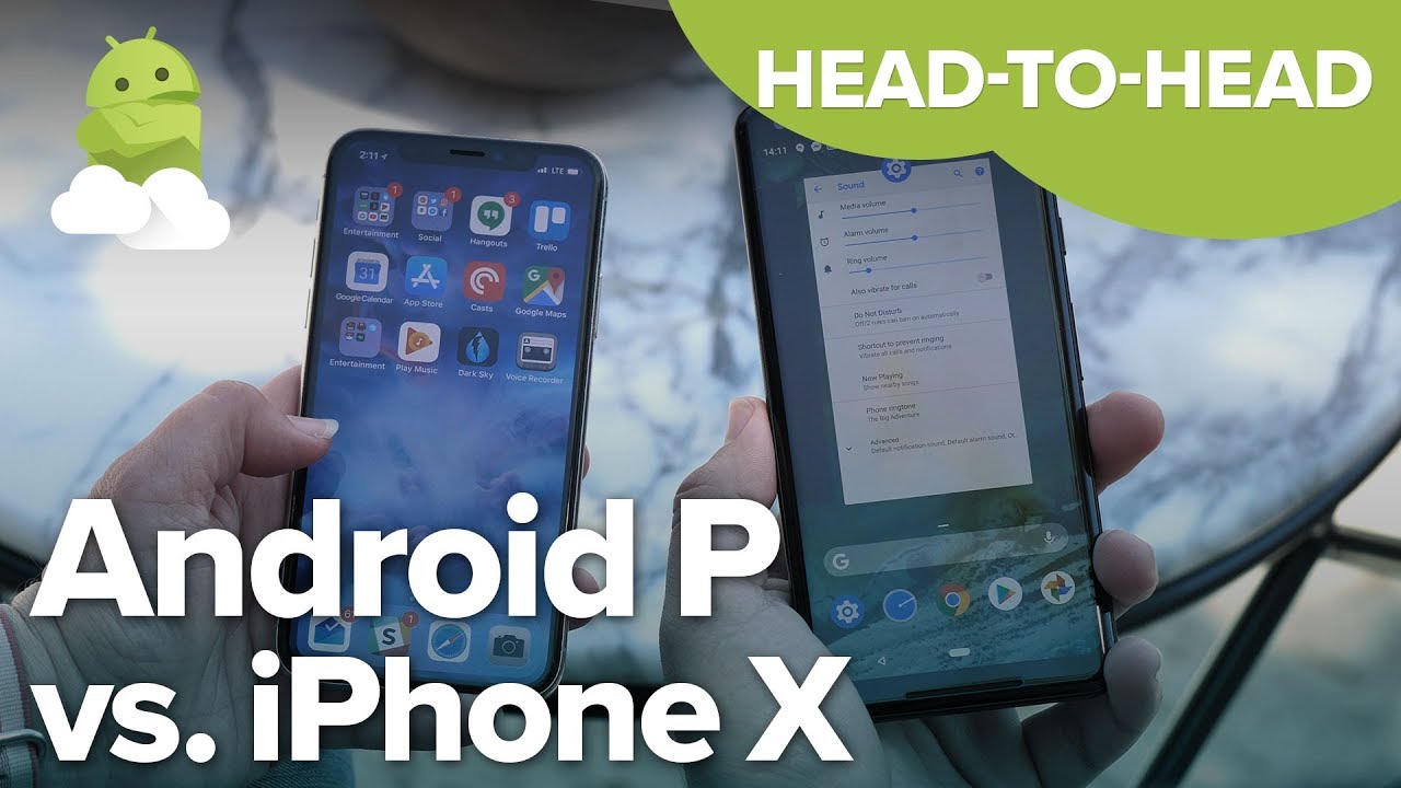
Google didn't come to this conclusion first, as we all know by now. Apple's iPhone X brought gesture navigation to the forefront for many people around the world, and in my opinion rescued iOS from its outmoded and frankly boring previous navigation system. In order to better understand how these two companies are approaching this new gesture-based world, it only makes sense to compare the two worlds as they exist now.
Swipe your cares away
The Android P Beta's inclusion of gestures is not the default navigation method -- at least not yet. You have to activate it to give it a try if you have installed it on one of the many phones currently participating in the new Beta, and I highly recommend everyone do so. Google has ditched the app switcher and home button in exchange for a small bar with a number of clever tricks. It can call up the app drawer with a long swipe, act as a home button with a tap, and makes accessing your quick tray of commonly used apps a breeze.
These things are important for a number of reasons, not the least of which is Apple doesn't do any of this in iOS. Instead of borrowing straight from what has been seen in the wild, like we've seen with other attempts at adding gestures to Android, Google has some clear efforts at an experience aimed at improving the overall Android experience.
At the same time, this is an early Beta you have to enable to gain access to. That means not everything is quite as smooth as it likely will be in the future. The triangular back button still exists all across the UI, and that Back button still doesn't have a uniform function across every app. Sometimes you'll go back one step in a menu, other times you'll leave the app entirely. That lack of uniformity doesn't exist in iOS, which allows for the simple arc gesture to flip between apps. While that would be a nice thing to see here on Android, it can't really happen until Google sorts out what the Back button is supposed to be on Android.
Give this to me everywhere
I'm a fan of gestures on iOS already, so it shouldn't surprise much to hear that I'm a fan of a similar experience on Android. But even in this early stage of development, this new gesture system on Android is really nice. It improves on the iOS experience in a few key places, and doesn't feel like a shoddy clone added just to seem competitive.
Most of all, I'm curious to see what happens when phone manufacturers get a hold of this gesture UI. Will this experience become a standard across phones, or are we in for a mess as OEMs try to bolt on new things or break the way Google intended for gestures to work?
Hear it from the other side: iMore compares the Android P navigation gestures to the iPhone X