Samsung has been at the forefront of new display technologies throughout recent history, pushing the limits of what AMOLED panels in phones and tablets can do. And beyond improvements in resolution, brightness and colors, Samsung has recently tinkered with curved and flexible displays of all sizes and types.
But in terms of real consumer products, that history is much shorter. It started with the Galaxy Round — a pretty basic phone that didn't do anything new aside from being curved. Then Samsung applied the curved tech to wearables with the Gear Fit, a neat little fitness band, and later in the year the Gear S, a 2-inch curved glass behemoth of a smartwatch.
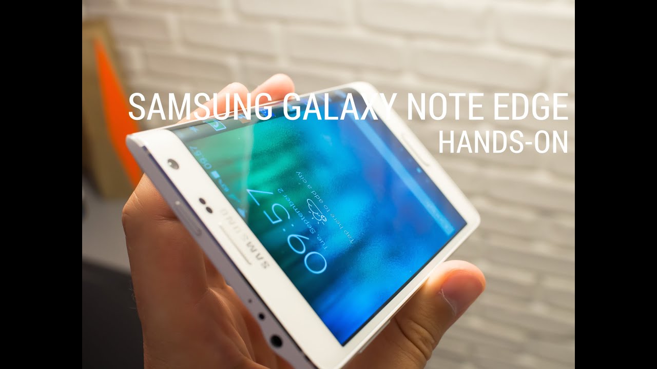
And then the Korean giant came out with something entirely different— the Galaxy Note Edge. Launched right alongside the flagship Galaxy Note 4, the Note Edge reveals its biggest trick in its name. Although it looks like a "normal" phone from most angles, the entire right edge of the screen is dramatically curved — enabling a few neat experiences that aren't possible with a flat display.
The Galaxy Note Edge is unlike any phone you've ever used before, and that's both good and bad. Read along with us for our full impressions of Samsung Galaxy Note Edge, and see how Samsung is trying to make curved displays a mainstream feature.

About this review
We're writing this review after a week using the black T-Mobile branded version of the Galaxy Note Edge in San Francisco and Seattle, with solid LTE coverage from the carrier. For a large portion of the review we also had a Gear S smartwatch connected over Bluetooth.

Galaxy Note Edge hardware
The Note 4 you know, now with a curved screen
When you first look at the Note Edge you immediately see that it's based on the design of the Note 4. It has a similar metal band around the outside edge — though the total quantity of metal is lower — as well as the same curves, shape and button layout.


You'll find the same S Pen, volume rocker, home button, camera pod, heart rate monitor, faux leather back plate and overall styling of the Note 4 — no extra changes were made outside of the necessary ones. But of course there's the little detail of the right edge of the phone looking like a Salvador Dalí painting — and that's where things change dramatically.
It's not just the display that's curved — the entire side of the phone is rounded off to accommodate this design change.

And it's not just the display that's curved, as the entire side of the phone is rounded off to accommodate this design change. The metal band that surrounds the sides of the Note Edge swoops down and around the curved portion of the display, providing a small lip at the edge of the screen that isn't present on the flat side. Samsung says this helps cut down on accidental touches and swipes of what it calls the "edge screen."
Though the physical designs are very similar, the Note Edge feels a bit different, not just because of the edge screen — we'll get to that a bit later — but because of the material choices.


It's apparent there's far less metal in use than in the Note 4.
Holding the Note Edge in your hand, it's apparent there's far less metal in use than before, and you don't quite get that higher-end, slightly cold to the touch feeling of the Note 4. The phone doesn't feel flimsy or bendable, but it does feel less premium than its flattened sibling, which in itself represented a positive step away from plasticky Samsung devices of old.
And that loss of quality is only partially made up for with the solid piece of screen glass flowing over the right-hand side, which does feel good once you get used to it — usually your palm never rests on the phone's screen.
It's a shame the Note Edge doesn't feel as nice, mainly because it's being positioned as a higher-end version of the Note 4, with a $120 jump in price to boot. But the design decisions were apparently necessary to deliver the edge screen, and you just can't make that big of a change to the footprint of a phone without making compromises elsewhere.

More: Samsung Galaxy Note Edge specs

Galaxy Note Edge display
No compromises with this curved panel
Unlike previous curved displays from Samsung (and other manufacturers), there's really no inherent tradeoff for having the curved portion of the Note Edge's display. Curve aside, this is a very similar 2560x1440 (QHD) Super AMOLED display, with the same brightness and color quality as you'll find on the Note 4, at 5.6-inches diagonally rather than 5.7. But of course it does have the curved portion, which adds 160 pixels of width, curved at a pretty tight radius along the right side.
Although Samsung lists the resolution as "2560 x 1440 + 160," it's actually all one panel. There's no physical separation of the screen at any point, just as we'd expect, and the distinction between the flat and curved portion is determined purely by the software. The curved glass on the display is of course also one piece, and it's quite nicely done too.


The Note Edge's so-called "edge screen" is really just a logical progression of tech demos Samsung been showing off at trade shows for some time now, but the fact that it's here and in a real consumer-buyable product is a big deal. It's hard to find any issue with the hardware implementation of the bendable display, and the ability to do it this time around opens up doors for more interesting curved form factors going forward.

Using the Galaxy Note Edge
An exercise in asking yourself 'why?'
We've covered the interesting physical and technical aspects of the Note Edge, but the most intriguing (and confusing) portion of this phone is what it's like to actually use. Samsung didn't curve the edge of this phone so that you end up using it the same way as any other, of course — the hardware and software aim to offer a unique user experience.
Interacting with the edge screen
When you're in an app the edge screen is simply pulled off to the side and blacked out, acting as a normal screen bezel would.
First, let's explain the basics of what the edge screen actually is. The edge screen has two main states — expanded and retracted. When you're in an app the edge screen is simply pulled off to the side and blacked out, acting as a normal screen bezel would.
A single swipe (but not a tap or palm press) in from the edge with any finger deploys the edge screen up over whatever content you're looking at, launching into the first panel you've selected to be there. Additional swipes in either direction scroll through the other panels you've enabled. Swipe up from the bottom edge on any panel to access the edge screen settings, or swipe down from the top of any panel to bring down the tools panel. As soon as you interact with the main display, the edge panel retracts.
That's your basic navigation paradigm, and it feels incredibly natural, even on a curved screen that not many of us are used to dealing with. Samsung has absolutely nailed the tap and palm rejection software, and the edge screen really only reacts when you want it to.


Edge screen software

The software for managing the edge screen is actually very basic, fitting in line with the minimal screen real estate you have to work with. Most of the functional customization comes down to the "panels" that you choose to have on your edge screen, of which you can have up to seven enabled at any given time.
The primary panel you're encouraged to enable is "favorite apps," which takes place of the standard bottom row of your app launcher on a normal phone (the Note Edge lacks that fixed bottom row of icons on the launcher, in fact). It can hold seven of your often-used apps or folders (or more if you want to scroll) in any order you wish, and it'll be the first panel shown whenever you're on the home screen or swipe in on the edge screen in any other app.
Out of the box there are nine panels in total to choose from:
- Favorite apps (explained above)
- S Health — displays step, distance and calorie information
- Twitter — trending topics in a scrolling list
- Yahoo Sports — scrolling list of updating sports scores from user-selected teams
- Yahoo News — scrolling worldwide news headlines
- Yahoo Finance — scrolling finance news and information
- Briefing — displays weather, missed calls, messages and notifications
- Contacts — scrolling list of your contacts
- Memory Match — a card matching game
- S Note launcher — mirrors functionality of the S Note widget
There are few panels available at launch, none are particularly compelling, and organizing them is a pretty clunky experience.
In addition to the pre-installed panels, there are also (at the time of this writing) eight panels in the Galaxy Apps store for download, though Samsung is naturally hoping that third-party developers use its edge screen SDK to make even more.
You can organize the panels in whatever order you want, though the way you do so is quite clunky. To change the ordering of the panels you need to check the boxes to enable panels in the order which you want them displayed, which isn't immediately apparent when you're customizing the edge screen. I'd greatly prefer a long press, drag and drop method or something of the sort. The way it's done now seems very rudimentary.
For panels that have customizable elements, such as the Yahoo Sports or Briefing panel, you can tap an edit button in the settings to choose what content gets pulled in by the panel or how it acts. Most of them are pretty basic or not customizable at all, though.

Beyond the individual panels, the edge screen also picks up all of your notifications and displays them just as the notification shade would, but vertically along the edge. There's no control over which notifications go to the edge screen, meaning every Hangouts message, every app update, every email and every Words With Friends notification pops up and covers a small portion of your screen with that information.
Any music that you're playing, regardless of app, will trigger the edge screen to display a music panel with basic album art and playback controls as well, just like a typical notification shade widget would. The camera also puts all of its controls on the edge screen, leaving the full screen open as a viewfinder (that is, if you shoot in 16:9 aspect ratio).
There's also a neat "night clock" mode, which can be set to run when the screen is off in up to a 12-hour period, which you define. The night clock mode subtly illuminates the edge screen with time, date and alarm information, and can work nicely as a clock on your bedside table, so long as you position your phone (and charger) correctly.

Daily life using the edge screen and panels
I didn't find any of the panels (pre-installed or downloadable) available today particularly compelling, though, and found it tough to work them into my regular use of the Note Edge.
The Twitter panel isn't customizable and when tapped doesn't work with third-party Twitter apps. The Yahoo apps are very limited in their customization of topics, and don't even include major leagues in many sports. Few people will actually need a scrolling list of their contacts or quick launch icons for S Note at the ready all of the time. And God help me if I ever need to surreptitiously play a mini game on a 160 pixel-wide screen on the side of my phone.
These are the big features that are supposed to be selling points of the Note Edge, but they don't feel thought out in any way. They're just there.


Almost all of the panels look really cool scrolling by in demo mode (I suppose that's part of the point), but in practice they're not massively useful right now. Content scrolls up vertically, making it hard to read when using your phone in portrait mode, as we all do a majority of the time, and is only available to view when you actually swipe in the edge screen on top of other content on your screen. The panels don't offer as much information as a widget, and lack usefulness as a secondary display because the edge screen disappears as soon as you touch the main app.
The Favorite Apps, S Health, Briefing and Tools panels — in particular the timer and ruler — are the only ones I found useful on the Note Edge, but they're still not really adding much to the experience. Having the Favorite Apps launcher was something I got used to for promptly switching between often-used apps in place of the Recents or Home keys, but it quickly became a bit of a confusing experience.
Your eyes and fingers never have a regular, repeatable motion to go through to use the phone, and that's a problem.
You go to the edge screen for some content and app launching, but then you need to go to the home screen and Recents menu for other content. Notifications come in on the edge screen, but if you don't tap it while its notifying you, you need to swipe down the notification shade to get to the actual notifications (or go to the Briefing panel, which loosely handles app notifications). Your eyes and fingers never have a regular, repeatable motion to go through to use the phone, and that's a problem.
The camera interface uses the edge screen to display the settings and shutter button, but it actually makes it tough to press that shutter button because it's now on a curved portion of the display facing away from you. And if you choose to shoot in 4:3 aspect ratio, as many do, it makes no sense to have the controls on the edge screen as they wouldn't be obstructing the viewfinder anyways.


But what about left-handed users?
A natural question comes about when looking at the asymmetrical design of the Note Edge: What about folks who hold the phone in their left hand? That's not just those who are left-hand dominant, of course — plenty of right-handed folks, myself included, use phones regularly in their left hand throughout the day.
"Rotate 180" lets you use the Edge upside down. And it works about as well as you'd expect.
Well of course Samsung wasn't going to make two versions of the Edge with the curve on opposite sides, and instead includes a "Rotate 180°" mode that lets you turn the Note Edge upside down, putting the edge screen on the left, and rotating the entire interface 180 degrees. You then get on-screen buttons for Recents, Home and Back, as the regular navigation buttons are now on the top of the phone.
It isn't elegant, pretty or a best-case scenario, but it does work. As frustrating as having to flip your phone upside down to use it is, trying to reach all the way from the left side of the screen to swipe on the edge screen is borderline impossible, so your only real option for left-handed use is to use the Rotate 180° mode.

Adding questionable value to the Note experience
Even ignoring the usefulness of the edge screen, the curved portion of the screen creates real problems for physically holding and using the Note Edge. The Note Edge is a full 6 millimeters wider than the Note 4 (which in itself isn't tiny), making a cross-device thumb reach even tougher — or let's face it, impossible for some hands.
The curve also makes standard right edge swipe gestures — including the very necessary "reduce screen size" gesture — in apps slightly more difficult, because there's no physical boundary between the "real" screen and the edge screen. Because the curve takes up the entirety of the right edge of the phone it also pushes the power button to the top of the device, the least logical location on a phone of this size.
A smaller device may solve some of these problems. In any case, these are all issues you'll have to deal with if you choose the Note Edge over its more mainstream sibling.


After a week with the edge screen, there's just not a single piece of software here that had me compelled to continue using it.
After a week of trying my best to use the Note Edge and the edge screen to its full potential, there's just not a single piece of software introduced here that had me compelled to continue using it. And there certainly aren't enough exciting features here to justify the awkward curved edge and the ergonomic issues it introduces.
I can understand the appeal of large phones and know why some folks want to use them. I'm even convinced that a Note 4 could be my primary phone. But there's a difference between a phone being large and a phone being awkward to use. The Note 4 is large, but the Note Edge is awkward.

Battery life, camera and software performance
All the Note 4 goodness carries over
Who knew that one small change in the form factor of a phone could alter so much? But in terms of battery life, the cameras and the rest of the software, things are basically unchanged compared to the Note 4.
The core Galaxy Note 4 experience is mostly intact, and that's a good thing.
The biggest difference numbers-wise is in the battery capacity, which has dropped to just 3000mAh. In terms of real-world use I never noticed a difference in battery life when compared to my Note 4. Of course the battery is only 7 percent smaller, and you're also dealing with a 5.6-inch (diagonal) screen versus 5.7 inches on the Note 4.
The same goes for the cameras, which are 16MP and 3.7MP on the back and front respectively, backed up by the same software (save for the edge screen enhancements) and processing. Samsung has stepped up its camera game coming from the Galaxy S5, and all of that tech is inside the Note Edge. The Note 4 boasts one of the best cameras on an Android phone, and the same is true of the Note Edge.

The one small discrepancy I noticed is in software performance, where the Note Edge can get bogged down when managing lots of different items across the main screen and edge screen simultaneously. For example when there's an intensive app running and then you go to interact with the edge screen, the main content can get sluggish. When you think about the extra layer of processing and animation that has to be done it makes sense, but it still doesn't make it OK. Fortunately the slowdowns were intermittent and small, and didn't actually hinder use of the phone in any huge way.
Of course the S Pen is still here and fully functional, with the supporting software features, and you can even use it to manipulate the edge screen if you wish. This is a Galaxy Note through and through.

Galaxy Note Edge: The Bottom Line
A tech demonstration that should've stayed as such
Having spent a long period of time using the Note 4 before and after our extensive review, I was interested to see how the Note Edge's curved display would change the experience. In my opinion the Note 4 one of the best phones of 2014, yet at the same time I see absolutely no reason why anyone should buy a Note Edge.
For the most part, the Edge behaves just like a Note 4 — but that doesn't mean it makes any sense as a complete package.
The Note Edge is a really novel idea, and for what it is it's executed quite well, particularly in terms of hardware and display technology. Samsung manages to introduce a rounded portion without compromising image quality, the software is fairly limited but speedy, and the rest of the phone is exactly the same same as the well-liked Note 4. But unfortunately that doesn't mean that the Note Edge actually makes any sense as a complete package.

The few bits of bundled software for the edge screen work as designed, but there's nothing here that couldn't be achieved with custom software on a completely flat display — and in many situations the edge screen complicates navigation paradigms on the phone. While the palm rejection on the curved portion of the phone is great, the phone is still far too wide to use one-handed from either side, whether you want to touch the edge screen or just reach across to tap a button. And to cap it all off, the Note Edge carries a $120 premium over the Note 4, putting the off-contract price north of $840.


So the Galaxy Note Edge doesn't do anything the Note 4 doesn't, and in many ways makes regular functions of the phone even harder to use than its sibling. And yet you're paying extra for that experience. The value proposition just doesn't make any sense to me — and neither does the Galaxy Note Edge as a whole.
If past devices are any indication Samsung will surely iterate on this idea and the technology behind it, and a more mature successor may emerge in the years ahead. But for now this is a technology demo that should've stayed as such, not a phone that you should buy over the Note 4.